The Benefits of Working with a Limited Color Palette
Color theory can be an intimidating part of the art-making process for both new and seasoned artists, but it doesn’t have to be! I’ve found that working with a limited color palette has been a fantastic way to simplify color and make my artwork look more sophisticated and modern. In this post, I’ll share what a limited color palette is, the benefits of working with a limited palette, and how you can create your own limited color palette for your next illustration.
First off, what is a limited color palette? Using a limited palette means that you’re only using a few select colors in your piece. It’s not an entire gamut of the rainbow, but just two or three colors that you stick to for the entire illustration.
Before we dive into the rest of the tutorial I want to share some of my favorite minimal palettes with you! You can download the palettes for free to use in your own artwork here.

The Benefits of a Limited Color Palette
There are a few key reasons that I prefer using limited color palettes in my work.
1) They usually feel a lot more sophisticated than when you’re doing something with a ton of different colors on the page. Don’t get me wrong, I love vibrant rainbow illustrations too, but they can tend to skew in the youthful direction. If that’s what you’re going for, that’s totally fine! I think there is absolutely a time and a place for using a wide range of colors in your artwork depending on the feel of the piece, the audience you’re targeting, and what kinds of emotions you’re trying to evoke with your art. But in my experience, the less color variation I have in a piece the more modern and sophisticated it feels.
2) Limited color palettes make things easier for us as artists. Fewer colors mean fewer color decisions I have to make as I’m illustrating. This helps save time and makes my illustration process much faster and more enjoyable!
3) It’s easier to make color adjustments with a limited color palette. If you know me, you know I love to whip up lots of different colorways for every single piece I create. Again, fewer colors mean fewer color edits! Limited palettes help speed up my workflow for adjusting color and help me create a wide variety of completely fresh color variations quickly.
How to Create Limited Color Palettes
Start with two or three colors
The key word to remember with a limited color palette is “limited.” I know that once you get into exploring color it can feel exciting to use every color under the sun, but to stick to a sophisticated limited palette it’s important to choose just two or three colors for your illustration.

Sometimes it’s helpful to add in some neutral colors like black, gray, and tan to balance things out, but other than that try your best to stick to just two or three main colors.

Use different values of the same color
Utilizing different values of the same color can give your limited color palette a little more visual interest. Value = lightness and darkness. After I’ve selected my main two or three colors for my limited color palette, I’ll choose another variation or value of that color to add to the palette.
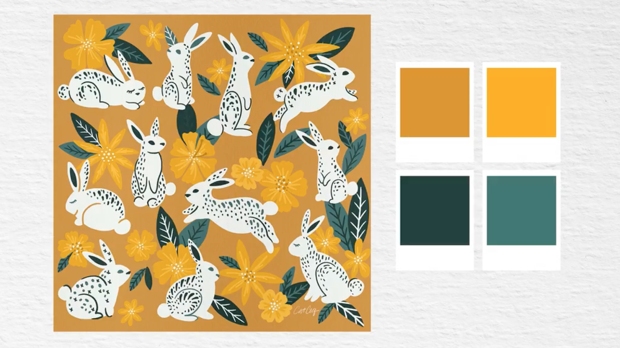
In this example, the dominant color of the composition is green, but I wanted to add accents of pink and orange to balance it out. I chose two values for each of the three main colors to give a little extra visual interest without overwhelming the composition.

When selecting different values for your limited color palette, I recommend having one darker and bolder color, and one lighter and less saturated. This gives you a great variety to work with while still keeping things limited.
Complementary colors
Complementary colors are colors that are across from each other on the color wheel like red and green, purple and yellow, and blue and orange.
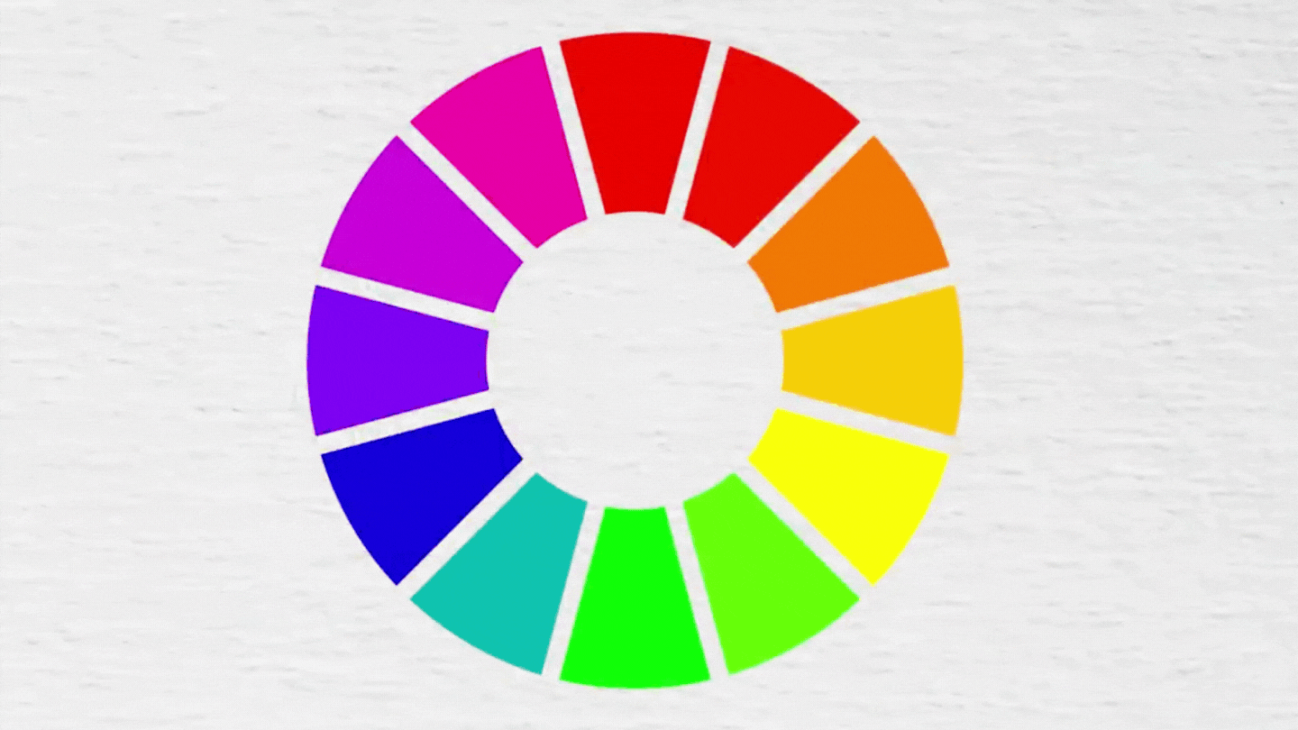
I find complementary color palettes to be some of the most visually appealing color combinations out there, so I use these a lot in my own work. One of my favorite complementary color combinations to use is blush and mint. These are in the red and green families so they are across from each other on the color wheel.

To use complementary colors in a limited palette, start by choosing which of your colors will be the dominant hue. In this Victorian House example, I used a blush and mint palette, but the dominant hue was blush. There are accents of mint throughout to contrast all that pink and I’ve also utilized neutrals like black and tan to balance out the composition and make the overall piece look more sophisticated.

Select a limited palette from a reference photo
My last tip is to pick your limited color palette from a reference photo! This will give you a good starting point so that you don’t have to pull colors out of thin air. You can choose a photo that resonates with you, and pick colors from it to create your palette.
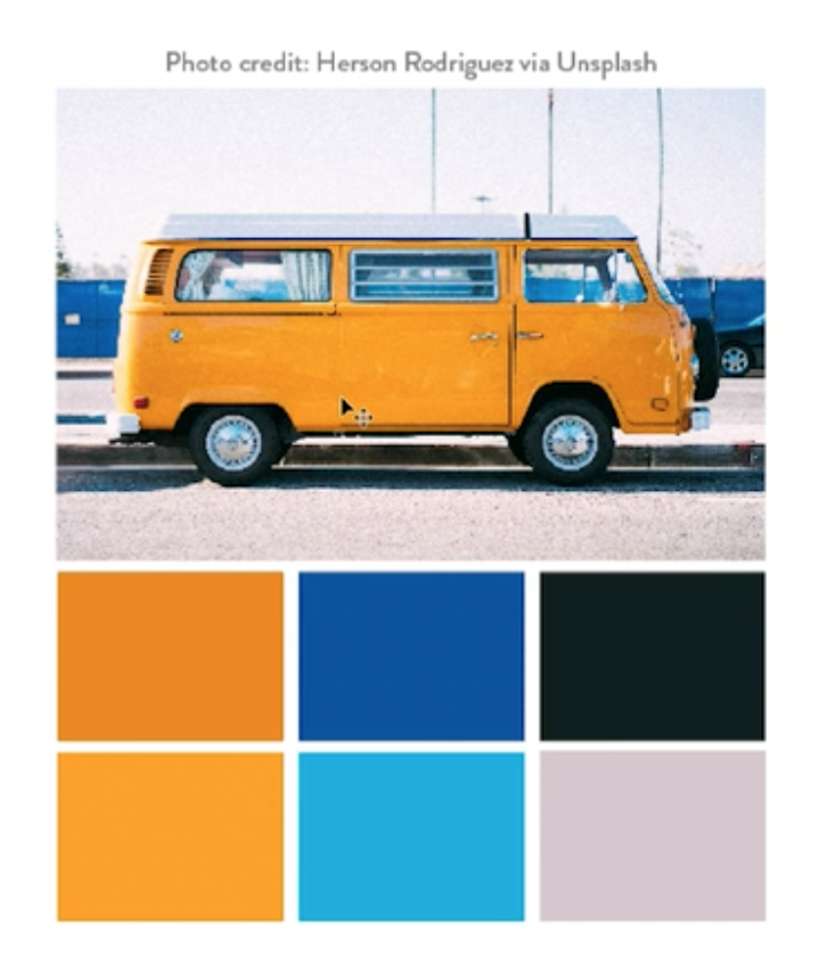
Photos also tend to have more variation in the different values of the same color, so this can be a great tool for practicing pulling together limited palettes. If you want to learn how to put together a color palette from a reference photo, check out this blog post that walks you through the process step by step!
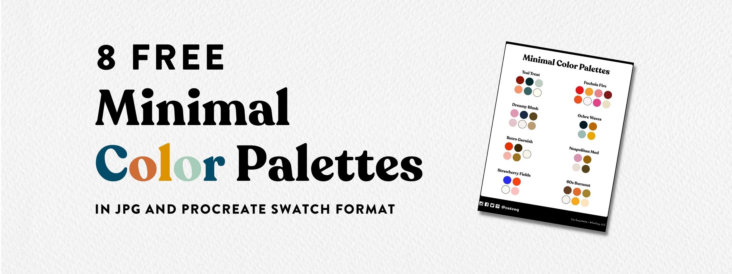
Use my limited color palettes to help you get inspired
If you’re still feeling stuck wondering where to start with creating a minimal palette, I’ve created a few palettes that you can use in your own artwork! Download the free limited color palettes here!
I hope that this post has inspired you to try out limited color palettes in your work. If you want a deep dive into all things color my class, Cultivating Color, is a thorough walkthrough of everything you need to know! In this class, you’ll learn step-by-step how to transform your artwork into a flourishing collection of color variations using a few simple tools in Adobe Photoshop.
There is a strategy behind choosing color palettes that sell well. More color options = more sales opportunities! For every illustration I make, I create five to ten different color variations out of the original artwork. This means I’m exponentially increasing my opportunities for art sales. Join me in the class here! You can enroll for free when you sign up for a free trial with Skillshare.
